

Logo Rationale: The Split O with Taper + Dot
Selected: March 2026 | Version: V11 | Rotated: April 2026
Why a New Logo
The original 2018 Objectuve logo was a bullseye target with an arrow passing through it. It served the brand well during its early phase, but as the product evolved into a gamified goal-tracking platform with a distinct anti-social philosophy, the logo needed to catch up. The bullseye was literal where the brand had become abstract. It was static where the product had become dynamic. And it didn't encode any of the visual language (gradient, glassmorphism, gold achievement accents) that now defines the Objectuve experience.
The full exploration is documented in Logo Refresh Exploration. This document explains why V11 was selected and how it encodes the brand's DNA.
The mark's geometry, color, and brand meaning below are current. For the wordmark's oblique treatment and the reveal/completion motion timing, see Logo refinement — V12 for the full design contract and derivation — the "Motion" and "Lockups" sections below have been reconciled to the shipped V12 values but summarize rather than replace it.
Naming note (OBJ-2459): V12 is a dated record and still calls the completion animation "Journey" (
ObjectuveLogoJourney.vueat the time it was written). Since OBJ-2459,ObjectuveLogoJourneynames a different component — the launch-interstitial sweep — and the completion animation isObjectuveLogoAchieved.vue. The "Motion" section below uses the current names throughout.
The Mark: V11 (Taper + Dot)
The Objectuve mark is a 270-degree arc ring that starts at 12 o'clock and sweeps clockwise through 3, 6, and 9 o'clock, tapering symmetrically at its trailing edge (9 o'clock), with a gold dot floating in the upper-left gap.
Three Elements, Three Stories
| Element | Visual | Brand Meaning |
|---|---|---|
| The Ring | 270-degree arc starting at 12 o'clock, gradient #177bbb to #05cbfc, outer radius 42, inner radius 28 | Progress in motion. Not closed, not complete -- always advancing. The ring represents accumulated effort: every check-in, every goal event, every day that adds up. |
| The Taper | Symmetric pinch at the trailing edge (9 o'clock), narrowing from 14px width to a gold-tipped point on the median radius | Directional energy. The ring isn't just a record -- it's actively growing. The leading edge is thinner because it's the newest part, still forming. This converts the mark from a noun (progress) to a verb (progressing). |
| The Gold Dot | Circle at cx=23, cy=23, r=5.5, fill #fcc419 (brand gold), positioned in the upper-left gap (~225 degrees) between the ring's trailing and leading edges | The next milestone. Gold is the achievement color throughout Objectuve (badges, XP pops, streak celebrations). The dot gives the eye a bridge across the gap (gestalt closure) while representing the reward that's within reach. |
Why These Three Together
The taper and dot encode Objectuve's two core gamification mechanics:
The taper = streaks. Continuous, directional, building. A streak is momentum made visible -- each day extends the line further. The taper's narrowing leading edge is the visual equivalent of "you're on day 14 and still going."
The dot = badges. Discrete, earned, golden. A badge is a waypoint -- you hit it, you celebrate, you move on. The gold dot sitting in the gap ahead of the ring is the next badge waiting to be unlocked.
Together, they tell the complete Objectuve story: sustained effort (streaks) toward meaningful milestones (badges).
How V11 Encodes Brand Philosophy
Anti-Social App
Objectuve is designed for ~10-minute sessions. Users check in, see their progress, act, and leave. The mark embodies this:
- The ring is open, not closed. It doesn't trap the eye in a loop. The gap provides an exit -- visually and philosophically.
- The taper points forward, not inward. The energy moves toward the gap, not back into the ring. The mark says "keep going" not "stay here."
- The gold dot is a destination, not a decoration. It pulls the eye out of the ring and into the space ahead. Reach it and move on.
Action Over Consumption
The mark is a verb, not a noun. V8a (the dot-only variant with blunt ring ends) told you where you are -- a status report. V11 tells you where you're going -- active encouragement. The symmetric taper is the visual difference between a dashboard and a coach.
Coach Who's Also a Friend
The taper is subtle, not aggressive. It's not a sharp arrow screaming "GO!" -- it's a gentle narrowing that says "you're on your way." The gold dot is warm and inviting, not demanding. Playful (a gleaming circle) but purposeful (it's the next milestone, not decoration).
Every Day Adds Up
The ring IS this philosophy made visible. Each degree of arc is another day of showing up. The 270 degrees filled represent the weight of consistency. The 90-degree gap represents what's still possible. And the gold dot in that gap says: the next achievement is closer than you think.
Color System
| Color | Hex | Role in Mark |
|---|---|---|
| Primary Blue (dark) | #177bbb | Gradient start -- the established, stable foundation of progress |
| Primary Cyan (light) | #05cbfc | Gradient end -- bright momentum, energy at the leading edge |
| Achievement Gold | #fcc419 | Taper tip + dot -- reward, celebration, milestone |
| Track Blue | #b0d4eb | Not used in final mark (explored in V12, rejected as clutter) |
The gradient flows diagonally from lower-right (dark blue, "where you started") to upper-left (bright cyan, "where you're headed"), placing the lighter cyan near the taper at 9 o'clock for visual consistency. This upward-left energy mirrors the ring's clockwise sweep toward its open gap.
Variants
| Variant | Use Case | Ring Fill | Tip | Dot |
|---|---|---|---|---|
| Gradient | Light backgrounds, primary use | #177bbb → #05cbfc gradient | #fcc419 | #fcc419 |
| Solid | Single-color contexts, print | #177bbb flat | #fcc419 | #fcc419 |
| White | Dark backgrounds | #ffffff | rgba(255,255,255,0.7) | rgba(255,255,255,0.7) |
| Black | Light backgrounds, monochrome print | #000000 | rgba(0,0,0,0.5) | rgba(0,0,0,0.5) |
Lockups
Integrated (Primary)
The mark replaces the O in "bjectuve". This is the primary logo invocation everywhere the wordmark appears. The icon IS the letter.
- Light backgrounds: Gradient mark + gradient wordmark
- Dark backgrounds: White mark + white wordmark
The wordmark ships as Outfit 800, sheared with an explicit skewX(-8deg) oblique — not a synthesized italic (Outfit has no italic cut). See Logo refinement — V12 for the pivot math and why it replaced the old synthesized-italic approach.
Horizontal
The mark sits to the left of the full word "Objectuve". Used when the integrated form is too small to read clearly (e.g., very compact layouts).
Stacked
The mark above the word "Objectuve". Used in square contexts (social avatars, app store listings).
Usage Guidelines
Minimum Sizes
| Context | Minimum Size |
|---|---|
| Icon mark (standalone) | 24px (below this, the dot and taper collapse) |
| Integrated lockup | 120px width (below this, "bjectuve" becomes illegible) |
Clear Space
Maintain clear space equal to the dot's diameter (11px at 100px scale) around all edges of the mark. No text, imagery, or other logos should encroach on this space.
Background Rules
- Gradient variant: Use on white or light neutral backgrounds only
- Solid variant: Use on white backgrounds or when gradient reproduction isn't possible
- White variant: Use on dark backgrounds (
#0B0E17midnight, dark UI surfaces, photos) - Black variant: Use on white/light backgrounds in monochrome print contexts
What Not to Do
- Do not rotate the mark
- Do not stretch or distort the proportions
- Do not recolor the gradient (the blue-to-cyan direction is intentional)
- Do not remove the dot (it provides essential gestalt closure)
- Do not remove the taper (it provides essential directionality)
- Do not place on busy backgrounds without sufficient contrast
- Do not add effects (drop shadows, glows, bevels)
- Do not animate the ring to a closed circle (360°) outside of the achieved animation -- it is intentionally open at 270° in all standard contexts
- Do not use the horizontal lockup where the integrated lockup fits -- the integrated form is always preferred
Motion
The ring IS a progress bar. Animating the fill reinforces the "every day adds up" story — you watch progress being built in real time. The arrowhead leading the fill embodies the anti-social philosophy: forward momentum, always advancing, no lingering.
Reveal Animation
Used on first presentation of the logo (sign-in, sign-up pages). The form content is hidden until the animation completes, giving the mark a moment to breathe.
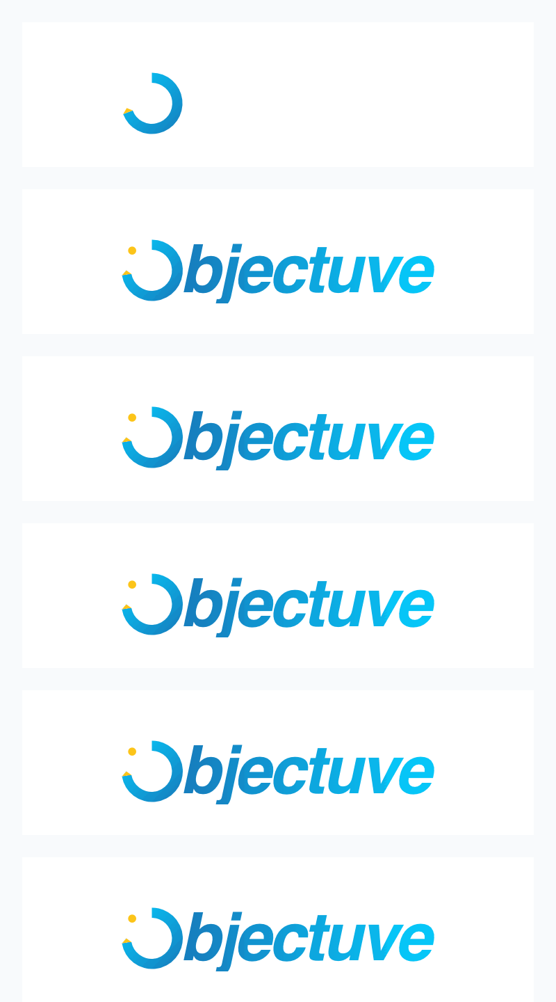
Sequence (1502ms total, tightened in V12 — see Logo refinement — V12):
| Time | Element | Action |
|---|---|---|
| 0ms | Arrowhead | Appears at 12 o'clock (top center) |
| 0–900ms | Ring + arrowhead | Arrowhead sweeps clockwise through 3 → 6 → 9, drawing the gradient ring behind it, and settles into its final symmetric taper at 9 o'clock. easeOutQuint deceleration (starts fast, slows hard into the last ~12° of sweep). |
| 792ms | Gold dot | Pops in with spring overshoot (scale 0 → 1.25 → 1.0) — timed to land while the ring is still closing its final ~12°, not after it settles |
| 882ms | "bjectuve" | Fades in + slides right (opacity 0→1, translateX -6→0) |
| 1502ms | Complete | Static mark — pixel-identical to the non-animated version |
The arrowhead leads the fill — it's not a reveal of a pre-drawn shape, it's the mark being actively built. This is a deliberate choice: the user sees progress being made, just as they will when they use the app.
Loading Animation
Used as a branded loading spinner throughout the app, replacing generic spinners. Icon-only (no wordmark, no dot).
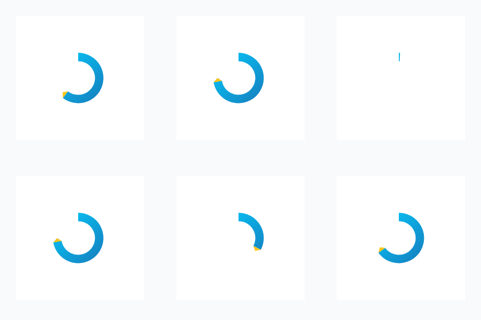
Cycle (1.4s per loop):
- Fill phase (0–770ms): Arrowhead sweeps from 12 o'clock clockwise through 270°, ring fills behind it (
easeOutCubic) - Hold (770–910ms): Brief pause at full fill
- Reset (910ms–1.4s): The tail sweeps clockwise to meet the head (
easeInOutCubic), unwinding the fill back to empty — the ring retracts the way it was drawn, not a fade
The loading loop uses the same arrowhead-led fill as the reveal, creating visual consistency between the "first impression" and "in-progress" states.
Journey Animation (Launch Sweep)
The mark drawing itself — a 900ms sweep with the gold taper leading, then the dot pops in. This is what plays on every cold launch (ionic_frontend/index.html's launch interstitial) and in its Storybook mirror, ObjectuveLogoJourney.vue.
The gesture originated on the about page (marketing_landing/about.html, .about-mark-animation) as a GSAP-driven scroll beat. The interstitial can't use GSAP or any JS — it has to paint before main.ts runs (see Launch interstitial pattern) — so the sweep is re-expressed as pure CSS @keyframes on inline SVG, reusing the reveal's own timing rather than approximating the about page's slower, scroll-triggered pace.
Implemented in: ionic_frontend/index.html (inline, zero-JS) and ObjectuveLogoJourney.vue (Storybook mirror — pure CSS, no requestAnimationFrame, no GSAP, so it stays a faithful preview of what actually ships at launch)
Timing — identical to the Reveal Animation's ring + dot beats above, copied verbatim between both files:
| Value | |
|---|---|
| Sweep duration | 900ms |
| Sweep easing | cubic-bezier(0.22, 1, 0.36, 1) (CSS form of easeOutQuint) |
| Dot pop delay | 792ms |
| Dot pop | 340ms cubic-bezier(0.34, 1.56, 0.64, 1) |
Rest track: the completed mark painted at low opacity (0.16 light / 0.18 dark) from frame 0, never animated. It carries the mark's silhouette across the hard cut from the native OS splash screen (a static PNG of the finished mark) to the interstitial — without it, that handoff would read complete → empty → redrawing. Reduced motion falls back to this same rest state (base CSS is the rest state; animation: none renders it), so a reduced-motion cold launch never shows a blank ring. Full contract, captures, and geometry notes: docs/ui-specs/logo-journey-splash.md.
Never loops. A launch surface that redraws every second is a spinner pretending to be a brand mark. ObjectuveLogoJourney.vue's loop prop exists only for Storybook inspection — the interstitial itself always plays once.
Achieved Animation (Celebratory)
Used on rare, high-value moments — milestone completions, major badge unlocks. The ring completes its full circle, celebrates, and rebuilds. This is the only time the ring reaches 360 degrees.
Implemented in: ObjectuveLogoAchieved.vue
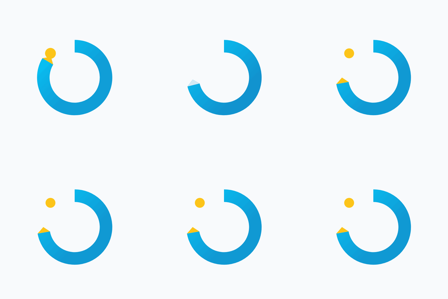
Phases (~3.94s total, measured — tightened in V12 from a 6.48s original; see Logo refinement — V12 for the full before/after):
| Phase | Duration | Description |
|---|---|---|
| Completing | 1.0s | Arc fills from 270° to 360° (closes the circle). The taper leads the final stretch. Gold dot dismisses as the gap closes. |
| Radiating | 0.9s | Blue-to-gold color transition, scale pop, radial burst rings expand outward, gold glow filter. The completed ring celebrates. Ignition (the dot's collision with the closing ring) now lands at ~159ms into this phase via easeOutQuart, not at the phase midpoint. |
| Resetting | 0.42s | Gold ring fades out gracefully, color transitions back to blue. |
| Breath | 0.12s | Silent moment at empty state — a beat before rebuilding. |
| Rebuilding | 1.1s | Arc rebuilds from 0° to 270°, retracing the original shape. Gold dot pops back in at the end. The mark is restored. |
Ray count dropped from 16 to 12 dashed spokes, and particle life shortened from 700ms to 520ms, so the burst reads as individual strokes rather than a stock sunburst.
Color interpolation during radiate phase:
- Ring transitions from primary gradient (
#177bbb→#05cbfc) to gold gradient (#f59e0b→#fcc419) - Smooth linear interpolation per channel
Effects: Gold glow filter (Gaussian blur), two radial burst rings expanding outward, soft bloom overlay via radial gradient, spring overshoot for dot re-entry.
Why the ring completes: This is a deliberate exception to the "never 360°" rule. The achieved animation represents a rare moment of genuine completion — a goal achieved, a rarity-tier badge earned. The ring closing is the visual payoff for months of effort. But it immediately resets and rebuilds, reinforcing that completion is a waypoint, not a destination. There's always a next goal.
Rare Celebratory Logo
The achieved animation doubles as the Rare celebratory logo — used exclusively for high-value moments tied to the Rare badge rarity tier and above (Rare, Epic, Legendary). This is the most expressive version of the mark and the only context where the ring reaches 360 degrees.
When to use:
| Trigger | Example |
|---|---|
| Rare+ badge unlock | Earning "Century Streak" (100-day streak), "Goal Crusher" (10 goals completed) |
| Major milestone completion | Completing a long-running goal, reaching a new rank (Open Road → Horizon) |
| Rank-up celebration | Advancing to a higher rank tier |
When NOT to use:
- Common badge unlocks (use a simpler XP pop or badge toast instead)
- Routine check-ins or daily streak ticks
- Loading states (use the loading animation)
- Marketing or static contexts (use the standard mark)
The rarity gate is intentional: if the celebration plays too often, it loses its punch. The achieved animation should feel like an event — something the user earns, not something the app dispenses.
Component: ObjectuveLogoAchieved.vue — supports autoplay, loop, variant (light/dark), and size props. Exposes a play() method for programmatic triggering after badge unlock or milestone events.
Why Not a Traditional Spinner?
A rotating spinner says "please wait." A filling progress ring says "progress is being made." Even when the loading state is indeterminate (we don't know how long it'll take), the fill-and-reset cycle maintains the brand's action-forward tone. The user sees momentum, not stasis.
Technical Implementation
The reveal, loading, and achieved animations are driven by JavaScript (requestAnimationFrame), not CSS. Each frame dynamically builds an SVG arc path with the arrowhead at the leading edge — this creates the effect of the ring being drawn by the arrowhead rather than revealed behind a mask. The Journey sweep is the exception — it has to paint before any JS runs (see above), so it's pure CSS @keyframes on a static SVG path instead.
- Component:
ObjectuveLogo.vue(reveal + loading, JS),ObjectuveLogoJourney.vue(Journey sweep, CSS),ObjectuveLogoAchieved.vue(Achieved celebration, JS) - Easing:
easeOutQuintfor the reveal's head sweep;easeOutCubic(fill) /easeInOutCubic(tail reset) for the loading loop;cubic-bezier(0.22, 1, 0.36, 1)(CSS form ofeaseOutQuint) for the Journey sweep;easeOutQuart/easeOutQuint/easeOutExpo/easeOutCubicacross achieved-animation phases - Frame rate: Native display refresh rate (typically 60fps)
- Performance: Single SVG path recalculation per frame. No DOM mutations beyond the
dattribute update. - Theme-aware: Light mode uses gradient fill, dark mode uses white fill. Gold dot and taper use
#fcc419(light) orrgba(255,255,255,0.7)(dark).
Key animation constants (ObjectuveLogo.vue:183-191,380-387,577-579):
| Constant | Value | Purpose |
|---|---|---|
START_ANGLE | 270 (= 12 o'clock) | Ring fill origin |
REST_SWEEP | 270° | Sweep extent (270° of fill) |
REVEAL_DURATION | 900ms | Time to fill the ring on reveal |
DOT_DELAY | −108ms | Offset from REVEAL_DURATION, not a pause — fires the dot at 88% of the sweep (792ms), while the ring is still closing its final ~12° |
REVEAL_TOTAL | 1502ms | Full reveal sequence: ring + dot + wordmark |
LOOP | 1400ms | Loading animation cycle time (local to startLoadingAnimation) |
TAPER_OFFSET_HERO / TAPER_OFFSET_COMPACT | 10° / 14° | Degrees before end where the taper begins, by size variant |
Motion Rules
- The ring always fills clockwise from 12 o'clock — never counterclockwise, never from a different starting position
- The arrowhead always leads the fill — the ring grows behind it, not ahead of it
- The dot always pops in last — it's the reward after the work is done
- The ring fills to 270° in standard animations. The gap is intentional. The only exception is the achieved animation, where the ring completes to 360° as a celebratory payoff before resetting.
- The loading loop never spins — it fills and resets. Rotation implies a different metaphor (machinery, gears). Filling implies progress.
The Exploration Journey
The path from concept to V11 involved 12 major iterations:
- V1-V6: Initial concept exploration (Keystone, Split O, Faceted Chevron) with wireframe and polished variants
- V7: Split O refined -- the 270-degree ring with gap emerged as the clear winner for its O-letterform duality and progress-ring metaphor
- V8a/b/c: Accent exploration -- gold dot (V8a), diamond fletching (V8b), shaft line (V8c). Gold dot won for warmth and achievement signal
- V9: Edge dot -- moved the dot from mid-gap to the ring's leading edge. Concept was right ("the next step") but the floating dot felt disconnected
- V10: Asymmetric taper -- the ring's outer edge extended past the circle into an arrowhead. Broke the O reading, looked like a canted C
- V10b: Symmetric taper -- both edges converge to a point on the median radius. Fixed the C problem but the empty gap felt vacant without the dot
- V11: Taper + Dot -- combined V10b's symmetric taper with V8a's gold dot. The taper provides directionality, the dot provides closure. Both signals reinforce the brand story
- V12: Taper + Track -- a faint circular track completing 360 degrees behind the ring. Rejected as visual clutter
V11 won because it solves every problem the exploration surfaced: directional energy (taper), gestalt closure (dot), achievement warmth (gold), O-letterform reading (circular silhouette), and competitive differentiation (no other goal app uses a tapered progress ring).
Technical Specifications
SVG Path (100x100 viewBox)
<!-- Gradient definition -->
<linearGradient id="objectuve-gradient" x1="92" y1="92" x2="8" y2="8">
  <stop offset="0%" stop-color="#177bbb"/>
  <stop offset="100%" stop-color="#05cbfc"/>
</linearGradient>

<!-- Ring with symmetric taper -->
<path d="M 50 8 A 42 42 0 1 1 9 57 L 15 50 L 22 55 A 28 28 0 1 0 50 22 Z" fill="url(#objectuve-gradient)"/>

<!-- Gold taper tip -->
<polygon points="9,57 15,50 22,55" fill="#fcc419"/>

<!-- Gold dot -->
<circle cx="23" cy="23" r="5.5" fill="#fcc419"/>
Geometry
- Center: (50, 50)
- Outer radius: 42
- Inner radius: 28
- Ring width: 14
- Median radius: 35 (where the taper tip lands)
- Arc sweep: 270 degrees, clockwise from 12 o'clock through 3, 6, to 9 o'clock
- Ring start: (50, 8) at 12 o'clock
- Taper: Symmetric pinch at 9 o'clock (outer at 9,57 / inner at 22,55 / tip at 15,50)
- Taper tip: (15, 50) on the median radius at 9 o'clock
- Dot center: (23, 23) in the upper-left gap (~225 degrees)
- Dot radius: 5.5
- Gradient direction:
x1="92" y1="92" x2="8" y2="8"(lower-right to upper-left)
Source Files
Production SVGs in ionic_frontend/src/assets/logo/:
- Icons:
icon-gradient.svg,icon-solid.svg,icon-white.svg,icon-black.svg - Lockups:
lockup-horizontal-gradient.svg,lockup-horizontal-dark.svg,lockup-integrated-gradient.svg,lockup-integrated-dark.svg,lockup-stacked-gradient.svg
Animation components in ionic_frontend/src/components/ui/:
ObjectuveLogo.vue— Reveal and loading animations, static renderingObjectuveLogoJourney.vue— Journey sweep (pure CSS), mirrors the launch interstitial (ionic_frontend/index.html)ObjectuveLogoAchieved.vue— Celebratory achieved animation
Canonical exploration SVGs in docs/brand/logo-archive/concepts/concept-b11-taper-dot/.
Rotation History
The V11 mark was originally drawn with the ring starting at 3 o'clock (the mathematical zero angle). In April 2026 (v3.4.37), the mark was rotated so the ring starts at 12 o'clock with the gap and taper landing at 9 o'clock.
Why rotate: Starting at 12 o'clock reads as "beginning at the top" — a more natural starting position for a progress metaphor. Clocks, speedometers, and fitness rings all start at 12. The original 3 o'clock starting position was a math convenience (0° in SVG arc coordinates), not a design decision.
What changed:
- All SVG paths recalculated (ring start, taper coordinates, dot position)
- Gradient direction flipped to keep lighter cyan near the taper
START_ANGLEconstant inObjectuveLogo.vuechanged from0to270- All 18 logo assets (icons, lockups, favicon, marketing) regenerated
- Animation GIFs re-captured
Last updated: 2026-09-11 (v4.8.3) — footer currency fix (OBJ-3649). The "Motion" (reveal, loading, journey, key animation constants) and "Lockups" typography sections remain reconciled against the shipped V12 wordmark and motion timing; see Logo refinement — V12 for the full design contract and derivations.